ShopDreamUp AI ArtDreamUp
Deviation Actions


Description
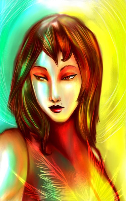
1. I was watching this pic with a feiend of mine and i realised how uncool was her face in the original version, imean in drawing terms, it was much more a pitning piece than a drawing peice, so i decided to be fair and draw more on this, and so i did this second version
2.It was also a whole issue how to submit this piece, first i thought in submit it over the fiers version and send the first to scraps, but i found that unfair coz a lot of people have faved dthe first one, so i submit this as a total different version
3. If you saw the fisrt version id like you to tell me your opinion") , maybe i am comminting a huge msitake and the first version was ok the way it was
, maybe i am comminting a huge msitake and the first version was ok the way it was
4. sorry if you faved the first and then you see this and think "arf what a rip why did i faved a work in process, and now i see a second version" i never see the first one as a wip.
5 this is the first time i re-work in a piece, and is great to be honest
Thansk to all poeple who faved the first one
2.It was also a whole issue how to submit this piece, first i thought in submit it over the fiers version and send the first to scraps, but i found that unfair coz a lot of people have faved dthe first one, so i submit this as a total different version
3. If you saw the fisrt version id like you to tell me your opinion
4. sorry if you faved the first and then you see this and think "arf what a rip why did i faved a work in process, and now i see a second version" i never see the first one as a wip.
5 this is the first time i re-work in a piece, and is great to be honest
Thansk to all poeple who faved the first one
Image size
500x800px 60.96 KB
Comments47
Join the community to add your comment. Already a deviant? Log In
Gorgeous.
This one will always have a special place in my heart. My girlfriend used a thumbnail size version of this for her avatar when I met her on a forum. So I will always associate this with her. And it is beautiful. Thank you very much.
Love the detailing in the hair, and gold is my favorite color.
This one will always have a special place in my heart. My girlfriend used a thumbnail size version of this for her avatar when I met her on a forum. So I will always associate this with her. And it is beautiful. Thank you very much.
Love the detailing in the hair, and gold is my favorite color.